Embarking on your React JS journey can be a thrilling yet daunting experience. With a plethora of concepts to absorb, it’s easy to feel overwhelmed by the numerous tutorials available. However, there’s a more effective way to master React: by building real-world projects.
Hands-on experience allows you to apply theoretical knowledge, identify knowledge gaps, and witness tangible results. Moreover, it’s an enjoyable process! Projects serve as more than just learning tools; they’re an excellent way to bolster your confidence and showcase your skills to potential employers.
Whether you’re designing an elegant UI or integrating robust APIs, each project propels you closer to becoming a React expert. Additionally, every project adds a unique dimension to your portfolio, enabling you to stand out in a competitive job market.
Key takeaways:
- Build real-world projects to master React JS
- Hands-on experience helps solidify knowledge and identify gaps
- Projects boost confidence, showcase skills, and enhance portfolio
- Each project brings you closer to becoming a React pro
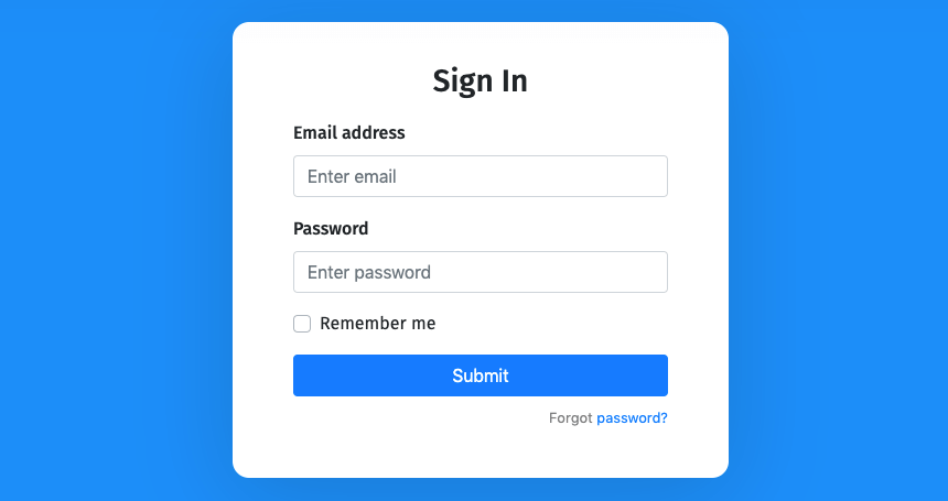
- Simple Login Form
Ready to Dive into React JS?
As a beginner, creating a simple yet practical project is an excellent way to get started with React JS. Building a login form is a fantastic project to begin with, allowing you to grasp fundamental concepts such as:
- Components: Learn how to break down your interface into reusable, modular components.
- State Management: Understand how to manage user input and interaction with your form.
- Styling: Discover how to apply CSS styles to create a visually appealing and functional login interface.
By completing this project, you’ll not only gain hands-on experience with React JS and CSS but also end up with a fully functional and stylish login form to showcase your skills.
Getting Started
Create a Project Folder:
- Make a new folder, for instance, “login-form”.
- Open this folder in your VS Code editor.
Initialize the Project:
Open your terminal by pressing Ctrl + J and then use Vite to create a new React app with this command:
npm create vite@latest ./ -- --template reactnpm install
npm run devProject Setup: Modifying Folders and CSS Files
Step 1: Remove Default Assets
Delete the default assets folder and App.css file from your project directory.
Step 2: Add Logos to Public Folder
Download the required logos and place the SVG files directly into your project’s public folder. Make sure to only include the individual SVG logo files, not the containing folder.
Step 3: Update index.css
Replace the entire content of the index.css file with the provided code snippet.
/* Importing Google Fonts - Montserrat */
@import url('https://fonts.googleapis.com/css2?family=Montserrat:ital,wght@0,100..900;1,100..900&display=swap');

* {
  margin: 0;
  padding: 0;
  box-sizing: border-box;
  font-family: "Montserrat", sans-serif;
}

body {
  display: flex;
  align-items: center;
  justify-content: center;
  min-height: 100vh;
  background: #5F41E4;
}

#root {
  width: 100%;
  padding: 0.6rem;
}

.login-container {
  margin: 0 auto;
  max-width: 410px;
  padding: 2rem 1.5rem;
  border-radius: 0.5rem;
  background: #fff;
  box-shadow: 0 10px 20px rgba(0, 0, 0, 0.1);
}

.login-container .form-title {
  text-align: center;
  font-size: 1.37rem;
  font-weight: 600;
  margin-bottom: 1.87rem;
}

.login-container .social-login {
  display: flex;
  gap: 1.31rem;
}

.social-login .social-button {
  display: flex;
  gap: 0.81rem;
  width: 100%;
  font-size: 1rem;
  font-weight: 500;
  cursor: pointer;
  padding: 0.75rem 0;
  border-radius: 0.31rem;
  align-items: center;
  justify-content: center;
  background: #F9F8FF;
  border: 1px solid #D5CBFF;
  transition: 0.3s ease;
}

.social-login .social-button:hover {
  border-color: #5F41E4;
  background: #f1eff9;
}

.social-login .social-button .social-icon {
  width: 23px;
}

.login-container .separator {
  position: relative;
  margin: 1.5rem 0;
  text-align: center;
  background: #fff;
}

.login-container .separator span {
  z-index: 1;
  font-weight: 500;
  color: #6652BE;
  position: relative;
  background: #fff;
  font-size: 1.06rem;
  padding: 0 0.9rem;
}

.login-container .separator::after {
  content: "";
  position: absolute;
  left: 0;
  top: 50%;
  height: 1px;
  width: 100%;
  background: #bfb3f2;
}

.login-form .input-wrapper {
  height: 54px;
  width: 100%;
  position: relative;
  margin-bottom: 1.5rem;
}

.login-form .input-field {
  width: 100%;
  height: 100%;
  outline: none;
  font-size: 1.06rem;
  border-radius: 0.31rem;
  border: 1px solid #bfb3f2;
  padding: 0px 1.25rem 0 3.12rem;
  transition: 0.2s ease;
}

.login-form .input-field:focus {
  border-color: #5F41E4;
}

.login-form .input-field::placeholder {
  color: #9284c8;
}

.login-form .input-wrapper i {
  position: absolute;
  top: 50%;
  height: 100%;
  display: flex;
  color: #a395e0;
  align-items: center;
  transform: translateY(-50%);
  transition: 0.2s ease;
}

.login-form .input-wrapper i:not(.eye-icon) {
  left: 0.93rem;
  pointer-events: none;
}

.login-form .input-field:focus ~ i:not(.eye-icon) {
  color: #5F41E4;
}

.login-form .input-wrapper i.eye-icon {
  display: none;
  right: 0.93rem;
  color: #917DE8;
  cursor: pointer;
  font-size: 1.25rem;
}

.login-form .input-wrapper .input-field:valid ~ .eye-icon {
  display: flex;
}

.login-form .forgot-password-link {
  display: block;
  width:fit-content;
  margin-top: -0.44rem;
}

.login-form .login-button {
  border: none;
  outline: none;
  width: 100%;
  height: 54px;
  color: #fff;
  font-size: 1.125rem;
  font-weight: 500;
  cursor: pointer;
  margin-top: 2.19rem;
  border-radius: 0.31rem;
  background: #5F41E4;
  transition: 0.3s ease;
}

.login-form .login-button:hover {
  background: #4320df;
}

.login-container .signup-prompt {
  text-align: center;
  font-size: 1.06rem;
  font-weight: 500;
  margin: 1.75rem 0 0.31rem;
}

.login-container a {
  color: #5F41E4;
  font-weight: 500;
  text-decoration: none;
}

.login-container a:hover {
  text-decoration: underline;
}
Step 1: Create Components Folder
Navigate to the src directory of your project and create a new folder named components. This folder will house the individual components that make up your Login Form.
Step 2: Create Component Files
Inside the components folder, create the following two files:
SocialLogin.jsxInputField.jsx
These files will contain the code for rendering social login buttons and input fields, respectively.
Step 3: Add Code to Component Files
Add the respective code to each of the newly created files:
- In
components/SocialLogin.jsx, add the code to render social login buttons for Google and Apple. - In
components/InputField.jsx, add the code to define the layout and functionality of the input fields.
These components will work together to create a fully functional Login Form.
const SocialLogin = () => {
  return (
    <div className="social-login">
      <button className="social-button">
        <img src="google.svg" alt="Google" className="social-icon" />
        Google
      </button>
      <button className="social-button">
        <img src="apple.svg" alt="Apple" className="social-icon" />
        Apple
      </button>
    </div>
  )
}

export default SocialLogin;
components/InputField.jsx
import { useState } from "react";

const InputField = ({ type, placeholder, icon }) => {
  // State to toggle password visibility
  const [isPasswordShown, setIsPasswordShown] = useState(false);

  return (
    <div className="input-wrapper">
      <input
        type={isPasswordShown ? 'text' : type}
        placeholder={placeholder}
        className="input-field"
        required
      />
      <i className="material-symbols-rounded">{icon}</i>
      {type === 'password' && (
        <i onClick={() => setIsPasswordShown(prevState => !prevState)} className="material-symbols-rounded eye-icon">
          {isPasswordShown ? 'visibility' : 'visibility_off'}
        </i>
      )}
    </div>
  )
}

export default InputField;
Finally, update the content of src/App.jsx with the provided code.
import SocialLogin from "./components/SocialLogin";
import InputField from "./components/InputField";

const App = () => {
  return (
    <div className="login-container">
      <h2 className="form-title">Log in with</h2>
      <SocialLogin />

      <p className="separator"><span>or</span></p>

      <form action="#" className="login-form">
        <InputField type="email" placeholder="Email address" icon="mail" />
        <InputField type="password" placeholder="Password" icon="lock" />

        <a href="#" className="forgot-password-link">Forgot password?</a>
        <button type="submit" className="login-button">Log In</button>
      </form>

      <p className="signup-prompt">
        Don't have an account? <a href="#" className="signup-link">Sign up</a>
      </p>
    </div>
  )
}

export default App;